
- Home
- Themes
The same window, your way
View → Theme changes how MDM looks at once and keeps everything where it was. Pick one of the built-in looks, each with a light and a dark side, or make your own in a text file.
-
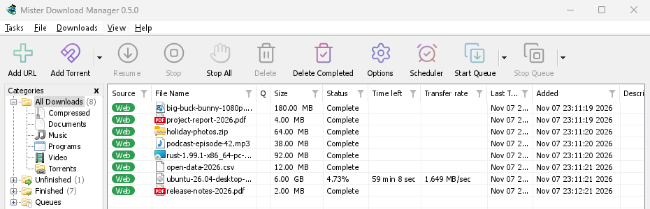
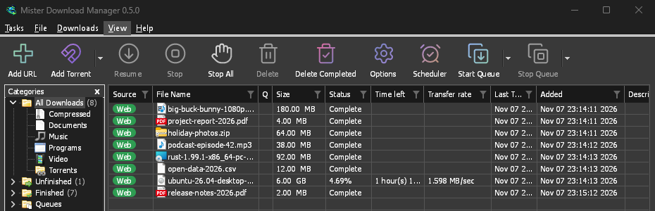
Classic
MDM's own look and the default: the layout IDM users know, with Windows 11's controls.
-
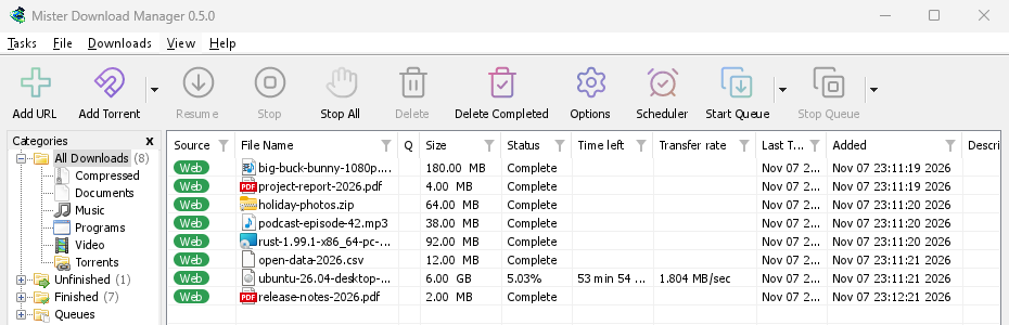
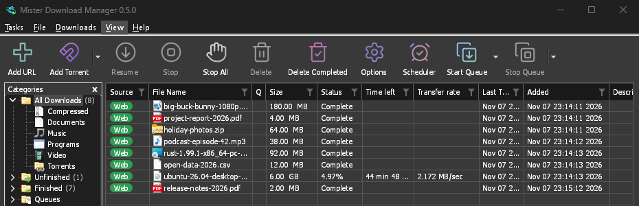
Native
Your system's accent colour and contrast setting, followed as you change them, on Windows, Linux and macOS.
-
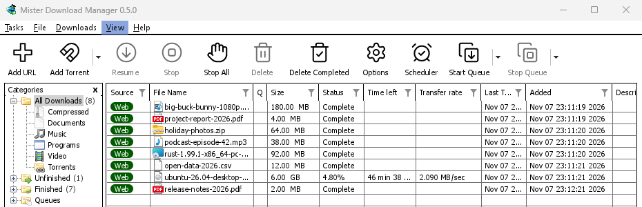
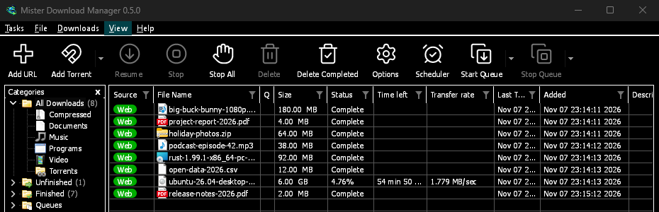
High contrast
Black and white, a bright accent, every edge drawn, text at 7:1 or more.
-
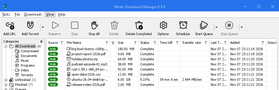
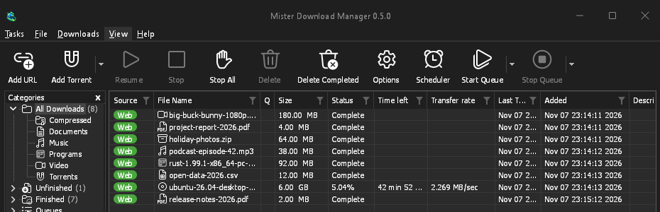
Metro
Windows 8's flat look: square corners, flat buttons and one-colour icons.
-
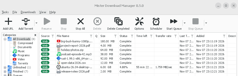
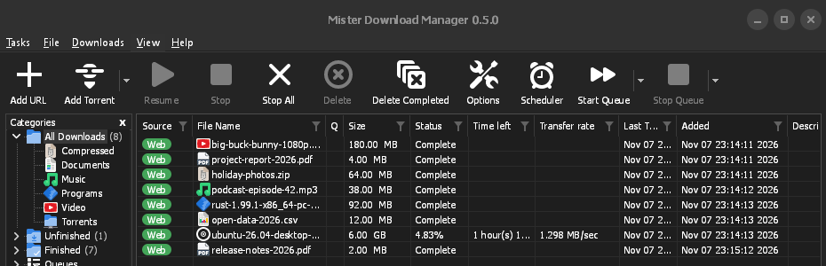
Adwaita
GNOME's look: round corners, flat grey buttons, a rounded focus ring and a header bar.
-
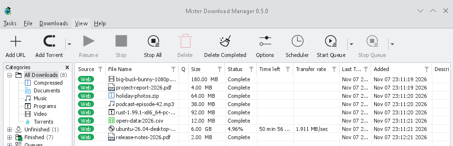
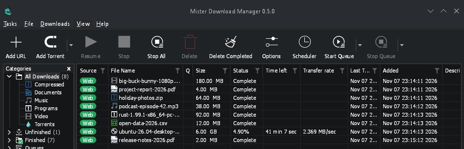
Breeze
KDE Plasma's look: rounded corners, controls that take the accent's edge, KDE's icons.
-
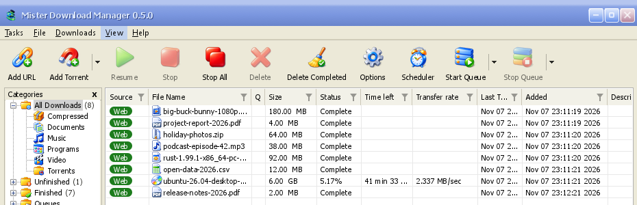
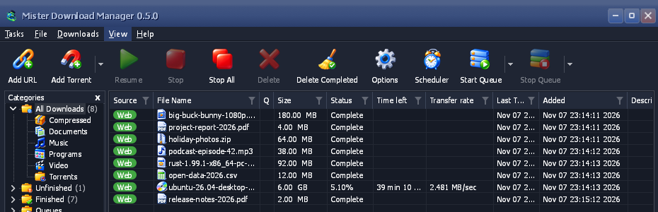
Luna
Windows XP's feel: shaded buttons with an orange glow, green ticks, a deep blue title bar.
-
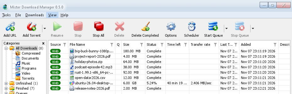
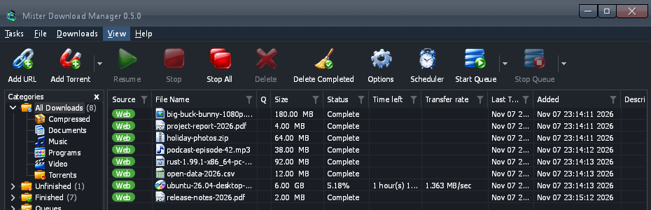
Aero
Windows 7's feel: glossy buttons, a glassy title bar and a glossy green progress bar.
-
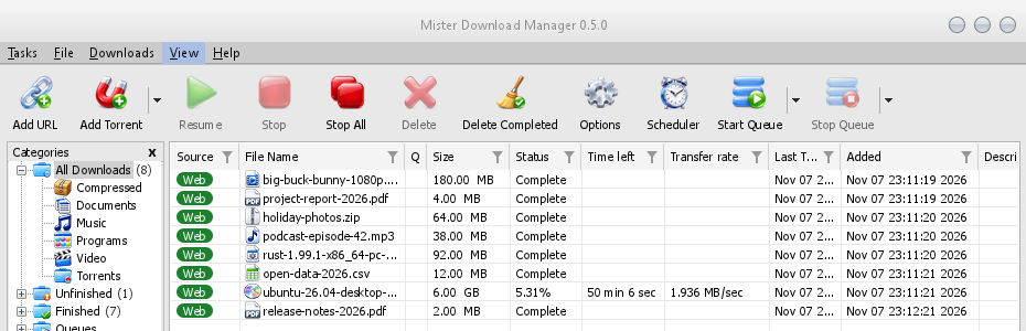
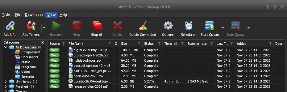
Aqua
Mac OS X's feel: gel buttons round at the ends, a blue focus ring and a blue gel progress bar.
- Make your own themeA text file of colours and sizes, tried in seconds. Three steps.
Make your own theme
A theme is one small text file, in TOML (or JSON). It names only what it changes; everything else comes from the theme it builds on. You don't need to build MDM or know how to program.
Make it
Start with a few colours, then add more as you go:
name = "Harbour" inherits = "classic" icons = "color" [seeds.light] background = "#eef3f6" surface = "#ffffff" text = "#11202b" accent = "#0f6c8c" [seeds.dark] background = "#14212a" surface = "#0e171d" text = "#e8f0f4" accent = "#5cc3e6" [sizes] radius = 6 [controls] focus = "ring"inheritsis the theme yours starts from:classic(the default),high-contrast,metro,adwaita,breeze,luna,aero,aqua, or another theme file in the same folder.[seeds]are a handful of colours (background,surface,header,text,accent,selection,error,warning,success) that MDM spreads over every control.[seeds.light]and[seeds.dark]give each side its own.[colors]sets single colour roles on both sides,[light]and[dark]on one side only:#rrggbb, or#rrggbbaawith transparency.[sizes]are corner radii, border widths, font sizes and row heights, in pixels.[controls]chooses the shape of text boxes, check boxes, buttons, progress bars, scroll bars, the focus mark and the title bar.iconsiscolor,monooraccent. A theme in a folder of its own (my-theme/theme.toml) can bring its icons inicons/16andicons/24, each named for what it shows (tb-add-url.svg,cat-music.png);-symbolicones take the theme's text colour.contrast = "high"strengthens every edge and text colour on top.
A key MDM doesn't know, or a value it can't read, is skipped and written to MDM's log (the
logsfolder beside the themes folder), so a file made for a newer MDM still loads. The built-in themes are written the same way: read them on GitHub.Every colour role (156)
Key What it colours windowWindows' and dialogs' background textText and glyphs text.disabledDisabled text, the one grey of every greyed control and label text.mutedSecondary text: notes, sizes, versions linkText that opens something errorError text error.strongA failed check's message in Options (connection, browser and helper tests) warningWarning text successSuccess text (a matching checksum) reach.nearA download's server near by its round trip (under 60 ms), in Properties reach.mediumA server at a medium round trip (60 to 150 ms) reach.farA server far by its round trip (over 150 ms) flag.edgeThe thin edge around a country's flag accentThe accent: focus lines, open and default controls, filters, links' focus focus.ringThe dotted keyboard focus rectangle selectionA selection's fill: rows, a chosen day, selected text selection.textText on the selection selection.mutedSecondary text on the selection selection.inactiveA selected row in a list without the focus selection.focusThe focused row's dotted outline on a selected row group.lineA group box's frame etch.shadowAn etched separator's shadow line etch.lightAn etched separator's highlight line tab.pageA tab page's body tabAn unselected tab, and the page's shadow tab.hotA tab under the pointer chevronA drop-down's or spin box's arrow chevron.disabledA greyed arrow subtle.hotA part with no face of its own (an arrow, a column header) under the pointer subtle.pressedSuch a part pressed or open highlight.hotA calendar's day or arrow under the pointer, a drop target highlight.pressedA calendar's day or arrow pressed fieldA text box's or a list's inside field.borderA text box's border field.bottomA text box's bottom line while it can be typed in field.disabledA greyed text box's inside field.disabled.borderA greyed text box's border field.readonlyA read-only text box's inside field.readonly.borderA read-only text box's border combo.chevronA drop-down's chevron combo.arrow.hotAn editable drop-down's arrow zone under the pointer combo.arrow.pressedAn editable drop-down's arrow zone pressed or open buttonA button's face button.hotA button's face under the pointer button.pressedA button's face pressed button.borderA button's border button.bottomA button's bottom edge button.textA button's text button.text.pressedA button's text pressed button.default.borderThe default button's border button.default.bottomThe default button's bottom edge button.disabledA greyed button's face button.disabled.borderA greyed button's border button.accentAn accent button's face button.accent.hotAn accent button's face under the pointer button.accent.pressedAn accent button's face pressed button.accent.bottomAn accent button's bottom edge button.accent.textAn accent button's text button.accent.text.pressedAn accent button's text pressed button.glowThe glow inside a button under the pointer, where the style draws one (Luna; transparent: none) glossThe shine glossy parts blend toward at their top: buttons, boxes, bars and title bars (Luna, Aero, Aqua) checkAn unchecked box's or radio's inside check.hotIts inside under the pointer check.pressedIts inside pressed check.borderAn unchecked box's or radio's border check.border.hotIts border under the pointer check.border.pressedIts border pressed check.border.disabledA greyed unchecked box's border check.onA checked box's or radio's accent check.on.hotThe checked accent under the pointer check.on.pressedThe checked accent pressed check.on.disabledA greyed checked box's fill check.markThe tick or dot on the checked accent progress.trackA progress bar's track progress.barA progress bar's fill meter.trackA meter's track (a download's part done) meter.edgeA meter's edge meter.fillA meter's fill listThe download list's background list.frameA list's, a table's or a box's outline gridGrid lines between a list's rows in dialogs list.gridThe download list's grid lines headerEvery list's and table's column headers header.lineA header's bottom line in dialogs' lists header.sepThe dividers between column headers table.lineThe dividers in the link grabber's and Add torrent's tables header.sortedThe sorted column's header header.sort-arrowThe sort chevron row.pressedA list row pressed chip.webThe download list's Web chip chip.torrentThe download list's Torrent chip chip.textText on a chip list.drag-ghostA column header being dragged list.marqueeThe rubber band that selects rows list.marquee.borderThe rubber band's edge scroll.trackA scroll bar's track scroll.cornerWhere two scroll bars meet scroll.thumbA scroll bar's thumb and arrows scroll.thumb.hotThe thumb or an arrow under the pointer scroll.thumb.pressedThe thumb or an arrow pressed or dragged menubarThe menu bar menubar.bottomThe menu bar's last row menubar.lineThe line under the menu bar menubar.hotA menu title under the pointer menubar.openThe open menu's title menuA menu's background menu.itemA menu item menu.hotA menu item under the pointer menu.borderA menu's and a popup's frame menu.sepA menu's separators menu.textA menu's text menu.glyphBullets, ticks and submenu arrows menu.text.disabledA greyed menu item toolbar.lineThe toolbar's top line toolbar.line.lightThe highlight under it toolbar.hotA toolbar button under the pointer toolbar.hot.faintA split button's other part while one is under the pointer toolbar.pressedA toolbar button pressed toolbar.hot.edgeA hot toolbar button's edge toolbar.hot.borderA hot toolbar button's border (transparent: none) toolbar.split.shadowA split button's divider at rest: its shadow toolbar.split.lightThe divider's highlight toolbar.text.disabledA greyed toolbar label toolbar.arrowA drop-down button's arrow icon.disabledA greyed icon's ink (its start) icon.disabled.endA greyed icon's ink (its end) treeThe categories tree's background tree.linesThe tree's dotted connectors tree.expanderThe tree's chevrons, where the variant draws them tree.frameThe categories pane's frame progress.statusThe progress window's Status value progress.label.disabledA greyed label in the progress window segments.borderThe segment bar's frame segments.cornerThe segment bar's corner pixels pieces.haveA torrent piece that is here pieces.partialA square standing for pieces partly here pieces.missingA piece not here yet captionA title bar MDM draws itself caption.textIts title and glyphs caption.text.inactiveIts title and glyphs while the window isn't the active one, and a greyed button's caption.hotA caption button under the pointer (a tint over the bar) caption.pressedA caption button pressed (a tint over the bar) caption.buttonA caption button at rest, where the style shows one (a tint over the bar; transparent: none) caption.closeClose under the pointer caption.close.textClose's glyph under the pointer caption.inactiveA title bar MDM draws, while its window isn't the active one (transparent: as when active) drop-target.edgeThe drop target's edge at rest egui.panelegui's panel background egui.windowTooltips' background egui.window.borderTooltips' border egui.textTooltips' text egui.selection.textSelected text's ink in egui's boxes egui.extremeegui's darkest (or lightest) background egui.faintegui's faint background egui.widgetegui's widgets at rest egui.widget.borderTheir border (transparent: none) Every size (26)
Key What it sets radiusCorner radius of buttons, text boxes and drop-downs radius.buttonCorner radius of a glossy push button (Luna, Aero; Aqua's are round at the ends) radius.partCorner radius of a tinted part (an arrow zone, a spin button) radius.checkCorner radius of a check box radius.flyoutCorner radius of a popup in a window (a calendar, a filter box) radius.menu-itemCorner radius of a menu item under the pointer radius.eguiCorner radius of egui's own widgets radius.popupCorner radius of tooltips borderWidth of a control's border focus-lineHeight of a focused text box's accent line chevron.widthStroke width of a drop-down's chevron font.dialogDialog text (Tahoma in IDM's dialogs) font.dialog.boldOptions pages' titles font.titleA window's headline (Tahoma Bold): the browser extension's, the helpers' font.codeA sign-in code to type at a service's page font.uiMenus and the main window's text (Segoe UI) font.ui.boldBold headings in the main window font.smallegui's small text font.bodyegui's body text: tooltips, multi-line boxes font.headingegui's headings list.rowHeight of a row in the download list list.headerHeight of the download list's column headers tooltip.widthWhere a tooltip's text wraps tooltip.margin-xA tooltip's left and right padding tooltip.margin-topA tooltip's top padding tooltip.margin-bottomA tooltip's bottom padding Every control style (7)
Key Its styles field-focusline, border, ring checkfluent, square, adwaita, breeze, luna, aero, aqua buttonfluent, breeze, luna, aero, aqua progressline, bar, blocks, gloss scrolloverlay, classic captionsystem, metro, adwaita, breeze, luna, aero, aqua focusdotted, ring, frame Or let an AI assistant write it
Copy this prompt into your AI assistant and describe the look you want at its end. It gives the assistant the format, the keys and the rules: readable text and a visible focus in both sides, and nothing copied from anyone else's artwork. Look at both sides yourself before you share the result.
You are making a theme file for Mister Download Manager (MDM), a free, open-source download manager. Write one TOML file, named after the theme in lower case with dashes (for example harbour.toml). Reply with the file only, in one code block, then one line on how to install it.

THE FORMAT
A theme names only what it changes; everything else comes from the theme it inherits.
- name = "Display name"
- inherits = "classic" (the default), "high-contrast", "metro", "adwaita", "breeze", "luna", "aero" or "aqua"
- icons = "color" | "mono" | "accent"
- contrast = "high" (optional: strengthens every edge and text colour)
- [seeds] a few colours MDM spreads over every control: background, surface, header, text, accent, selection, error, warning, success. Use [seeds.light] and [seeds.dark] to give each side its own.
- [colors] single colour roles for both sides; [light] and [dark] for one side only. Role names are dotted and must be quoted when they contain a dot, e.g. "button.hot" = "#e5f1fb". Useful roles: window, text, text.muted, link, accent, focus.ring, selection, selection.text, field, field.border, button, button.hot, button.pressed, button.border, button.text, check.on, check.mark, progress.bar, list, header, menubar, menu, menu.hot, menu.text, toolbar.hot, tree, caption, caption.text, scroll.thumb, gloss (the shine glossy parts blend toward), button.glow. "segments.done" takes one colour or a list of 13 (top to bottom).
- [sizes] in pixels, 0 to 400: radius, radius.button, radius.check, radius.menu-item, radius.popup, border, focus-line, list.row, list.header, font.ui, font.dialog.
- [controls] shapes: field-focus = line | border | ring; check = fluent | square | adwaita | breeze | luna | aero | aqua; button = fluent | breeze | luna | aero | aqua; progress = line | bar | blocks | gloss; scroll = overlay | classic; focus = dotted | ring | frame; caption = system | metro | adwaita | breeze | luna | aero | aqua.
- Colours are "#rrggbb" or "#rrggbbaa". Unknown keys are skipped, so only use the names above.

THE RULES
1. Make both a light and a dark side: give [seeds.light] and [seeds.dark] (or [light] and [dark]) their own colours, and check each side on its own.
2. Text must be easy to read: at least 4.5:1 contrast for text against its background (text on window and field, button.text on button, menu.text on menu, selection.text on selection, caption.text on caption), in both sides.
3. The keyboard focus must be easy to see: accent and focus.ring at least 3:1 against what they sit on.
4. Disabled text stays readable but clearly dimmer than normal text.
5. Clean room: no artwork, icons, logos, fonts or text copied from any other program or company. If the theme needs icons, describe original ones to draw, never copy existing ones, and note their source and licence in a SOURCES.txt.
6. Keep the layout: a theme changes colours, sizes and control shapes only.

After the file, list each text and background pair you checked with its contrast ratio, for both sides.

THE LOOK I WANT:
Try it, without building MDM
Put the file in MDM's themes folder. View → Theme → Open themes folder opens it, and makes it the first time. It is in MDM's data folder:
- Windows
%APPDATA%\misterdownloadmanager\themes- Linux
~/.local/share/misterdownloadmanager/themes- macOS
~/Library/Application Support/misterdownloadmanager/themes- Portable copy
data\themesbeside the program
Within two seconds it shows in View → Theme, under the built-in themes, by the
nameit gives itself. Pick it and the whole window changes at once. After you edit the file, pick it again in View → Theme to see the change. View → Dark Mode support and Always dark switch between its light and dark side.View → Theme → Add a theme file… does it for you: pick the file anywhere, and MDM copies it into the themes folder and uses it at once.
Already have a Base16 or pywal scheme?
It's a theme already. A Base16 or Base24 scheme (
.yaml) or pywal'scolors.json, added the same way, changes MDM's colours and nothing else: the scheme's backgrounds behind the list and the windows, its text kept readable (4.5:1 or more), its blue on the focus, the selection and the progress bar. Oncewalhas run, View → Theme lists pywal, read from~/.cache/wal/colors.json(%USERPROFILE%\.cache\wal\colors.jsonon Windows), and MDM follows each new wallpaper's colours within two seconds. The guide shows which colour goes where.
Free, open source, no ads, no trial.
Download Mister Download Manager