

-
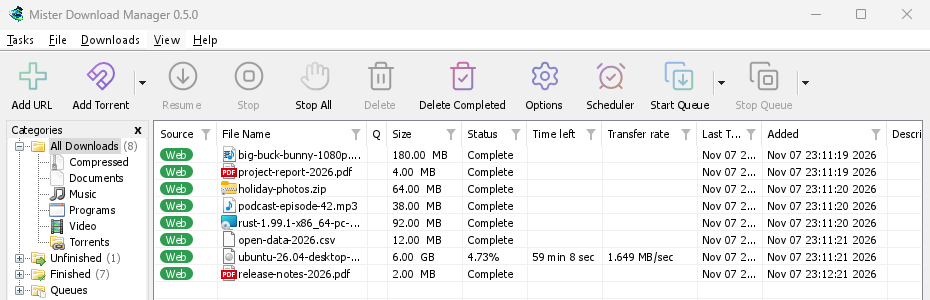
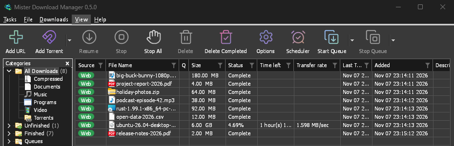
经典
MDM 自己的外观和默认设置:IDM 用户熟悉的布局,带有 Windows 11 的控件。
-
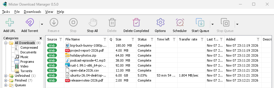
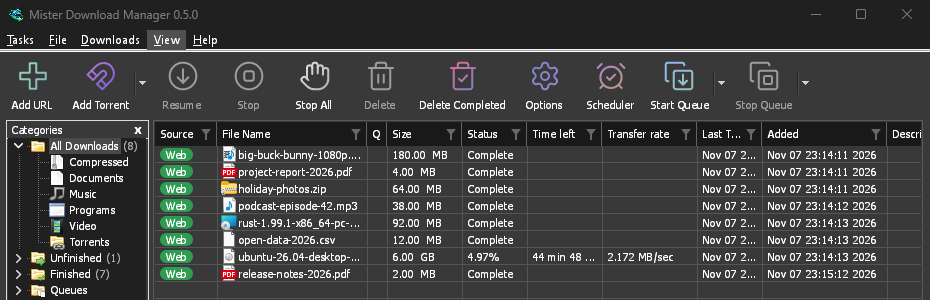
原生
在 Windows、Linux 和 macOS 上,MDM 会跟随您更改系统强调色和对比度设置。
-
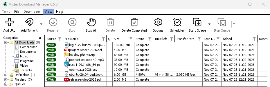
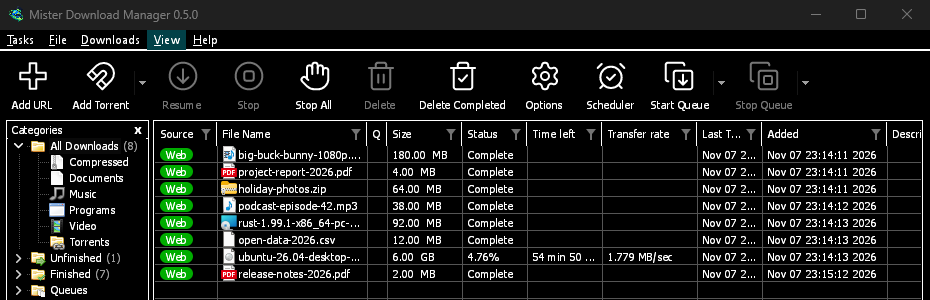
高对比度
黑白分明,明亮的强调色,每条边缘都清晰可见,文本对比度达到 7:1 或更高。
-
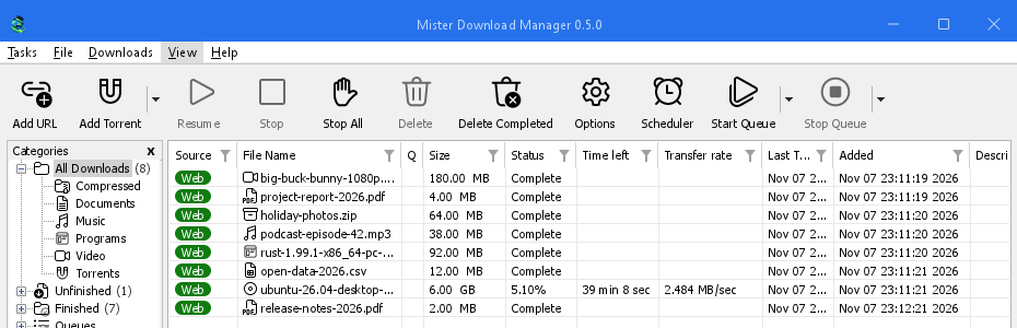
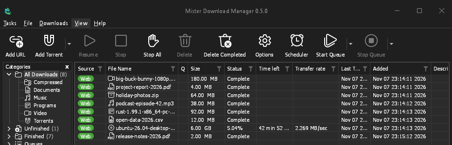
现代
Windows 8 的扁平外观:方形边角、扁平按钮和单色图标。
-
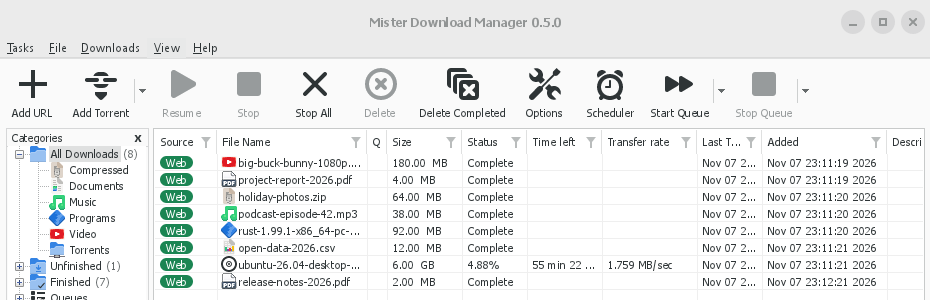
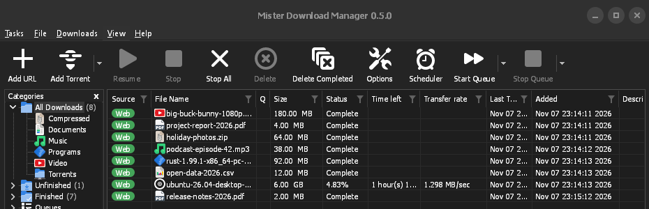
Adwaita
GNOME 的外观:圆角、扁平灰色按钮、圆形焦点环和标题栏。
-
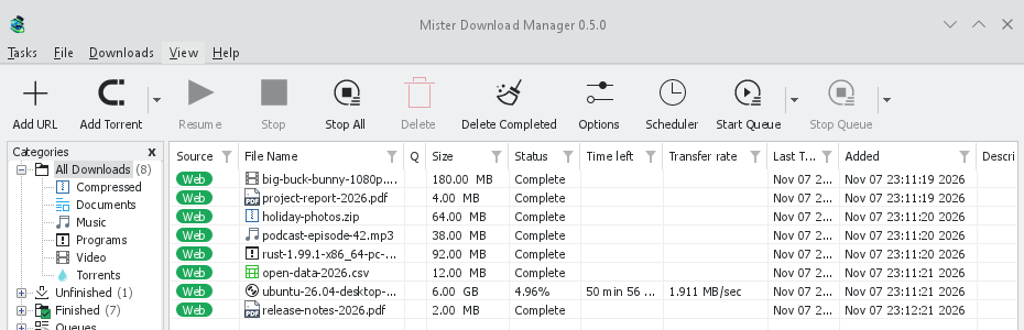
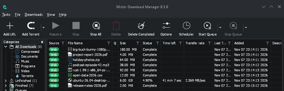
Breeze
KDE Plasma 的外观:圆角、带有强调色边缘的控件、KDE 的图标。
-
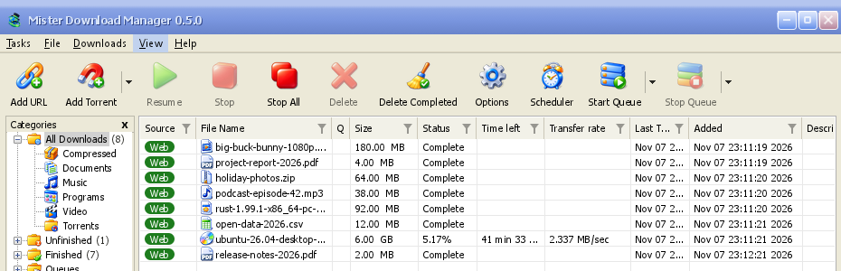
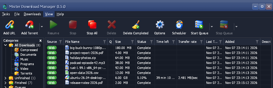
Luna
Windows XP 的感觉:带有橙色光晕的阴影按钮、绿色对勾、深蓝色标题栏。
-
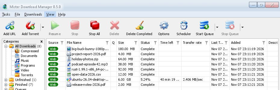
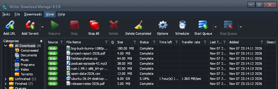
Aero
Windows 7 的感觉:光泽按钮、玻璃质感标题栏和光泽绿色进度条。
-
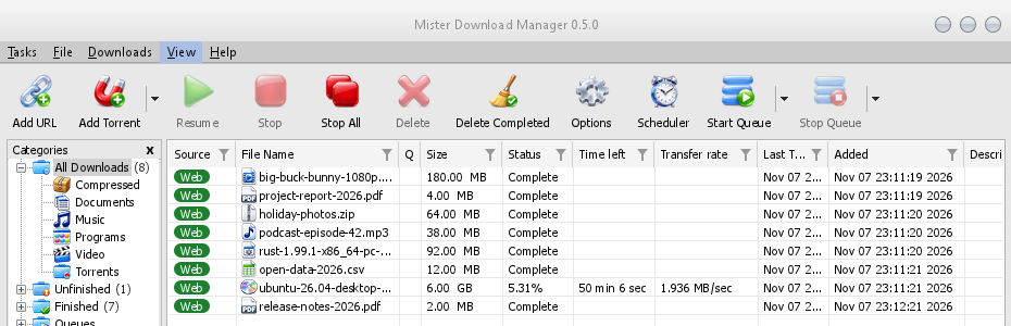
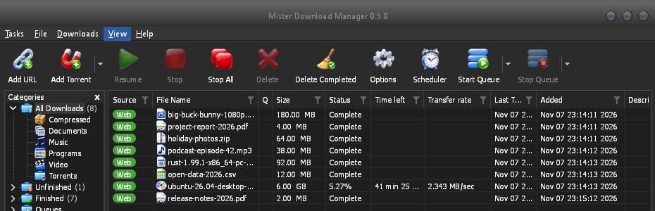
Aqua
Mac OS X 的感觉:两端圆润的凝胶按钮、蓝色焦点环和蓝色凝胶进度条。
- 创建您自己的主题一个包含颜色和尺寸的文本文件,几秒钟即可试用。只需三步。
创建您自己的主题
主题是一个小的 TOML(或 JSON)文本文件。它只命名它所更改的内容;其他所有内容都来自它所基于的主题。您无需构建 MDM 或了解如何编程。
制作它
从几种颜色开始,然后逐步添加更多:
name = "Harbour" inherits = "classic" icons = "color" [seeds.light] background = "#eef3f6" surface = "#ffffff" text = "#11202b" accent = "#0f6c8c" [seeds.dark] background = "#14212a" surface = "#0e171d" text = "#e8f0f4" accent = "#5cc3e6" [sizes] radius = 6 [controls] focus = "ring"inherits是您的主题所基于的主题:classic(默认)、high-contrast、metro、adwaita、breeze、luna、aero、aqua,或同一文件夹中的另一个主题文件。[seeds]是 MDM 分布到每个控件上的一些颜色(background、surface、header、text、accent、selection、error、warning、success)。[seeds.light]和[seeds.dark]为每一侧提供自己的颜色。[colors]设置两侧的单一颜色角色,[light]和[dark]仅设置一侧:#rrggbb,或带有透明度的#rrggbbaa。[sizes]是像素为单位的圆角半径、边框宽度、字体大小和行高。[controls]选择文本框、复选框、按钮、进度条、滚动条、焦点标记和标题栏的形状。icons是color、mono或accent。主题文件夹(my-theme/theme.toml)中的图标可用于icons/16和icons/24,每个图标都以其显示内容命名(tb-add-url.svg、cat-music.png);-symbolic的图标采用主题的文本颜色。contrast = "high"加强了每个边缘和顶部的文本颜色。
MDM 不认识的键或无法读取的值将被跳过并写入 MDM 日志(主题文件夹旁边的
logs文件夹),因此为较新 MDM 创建的文件仍然可以加载。内置主题也是以相同方式编写的:在 GitHub 上阅读它们。所有颜色角色 (156)
键 着色对象 windowWindows 和对话框背景 text文本和字形 text.disabled禁用文本,所有灰色控件和标签的灰色 text.muted次要文本:注释、大小、版本 link打开内容的文本 error错误文本 error.strong“选项”中失败检查的消息(连接、浏览器和助手测试) warning警告文本 success成功文本(匹配的校验和) reach.near“属性”中,往返时间较短(低于 60 毫秒)的下载服务器 reach.medium往返时间中等(60 到 150 毫秒)的服务器 reach.far往返时间较长(超过 150 毫秒)的服务器 flag.edge国旗周围的细边 accent强调色:焦点线、打开和默认控件、过滤器、链接焦点 focus.ring虚线键盘焦点矩形 selection选区填充:行、选定日期、选定文本 selection.text选区上的文本 selection.muted选区上的次要文本 selection.inactive列表中未获得焦点的选定行 selection.focus选定行上获得焦点的行的虚线轮廓 group.line分组框的边框 etch.shadow蚀刻分隔线的阴影线 etch.light蚀刻分隔线的高亮线 tab.page选项卡页的主体 tab未选中标签页及页面阴影 tab.hot鼠标指向的标签页 chevron下拉框或微调框的箭头 chevron.disabled置灰的箭头 subtle.hot鼠标指向的无独立外观部分(箭头、列标题) subtle.pressed此类部分被按下或打开时 highlight.hot鼠标指向的日历日期或箭头,拖放目标 highlight.pressed日历日期或箭头被按下时 field文本框或列表内部 field.border文本框边框 field.bottom可输入时文本框的底线 field.disabled置灰文本框内部 field.disabled.border置灰文本框边框 field.readonly只读文本框内部 field.readonly.border只读文本框边框 combo.chevron下拉框的V形箭头 combo.arrow.hot鼠标指向的可编辑下拉框箭头区域 combo.arrow.pressed可编辑下拉框箭头区域被按下或打开时 button按钮表面 button.hot鼠标指向的按钮表面 button.pressed按钮表面被按下时 button.border按钮边框 button.bottom按钮底边 button.text按钮文本 button.text.pressed按钮文本被按下时 button.default.border默认按钮边框 button.default.bottom默认按钮底边 button.disabled置灰按钮表面 button.disabled.border置灰按钮边框 button.accent强调按钮表面 button.accent.hot指针下的强调按钮表面 button.accent.pressed强调按钮被按下时的表面 button.accent.bottom强调按钮的下边缘 button.accent.text强调按钮的文本 button.accent.text.pressed强调按钮被按下时的文本 button.glow指针下按钮内部的光晕,如果样式有绘制(Luna;透明:无) gloss光泽部分顶部融合的光泽:按钮、方框、进度条和标题栏(Luna、Aero、Aqua) check未选中复选框或单选框的内部 check.hot指针下其内部 check.pressed按下时其内部 check.border未选中复选框或单选框的边框 check.border.hot指针下其边框 check.border.pressed按下时其边框 check.border.disabled灰色未选中复选框的边框 check.on选中复选框或单选框的强调色 check.on.hot指针下选中的强调色 check.on.pressed按下时选中的强调色 check.on.disabled灰色选中复选框的填充色 check.mark选中强调色上的勾或点 progress.track进度条的轨道 progress.bar进度条的填充 meter.track计量器的轨道(下载已完成的部分) meter.edge计量器的边缘 meter.fill计量器的填充 list下载列表的背景 list.frame列表、表格或方框的轮廓 grid对话框中列表行之间的网格线 list.grid下载列表的网格线 header所有列表和表格的列标题 header.line对话框列表中标题的底线 header.sep列标题之间的分隔线 table.line链接抓取器和“添加种子”表格中的分隔线 header.sorted已排序列的标题 header.sort-arrow排序箭头 row.pressed列表行被按下时 chip.web下载列表的“Web”标签 chip.torrent下载列表的“种子”标签 chip.text标签上的文字 list.drag-ghost正在拖动的列标题 list.marquee选择行的橡皮筋 list.marquee.border橡皮筋的边缘 scroll.track滚动条的轨道 scroll.corner两个滚动条交汇处 scroll.thumb滚动条的滑块和箭头 scroll.thumb.hot指针下的滑块或箭头 scroll.thumb.pressed滑块或箭头被按下或拖动时 menubar菜单栏 menubar.bottom菜单栏的最后一行 menubar.line菜单栏下方的线条 menubar.hot指针下的菜单标题 menubar.open已打开菜单的标题 menu菜单的背景 menu.item菜单项 menu.hot指针下的菜单项 menu.border菜单和弹出窗口的边框 menu.sep菜单的分隔线 menu.text菜单文字 menu.glyph项目符号、勾选标记和子菜单箭头 menu.text.disabled置灰的菜单项 toolbar.line工具栏的顶线 toolbar.line.light指针下的高亮部分 toolbar.hot指针下的工具栏按钮 toolbar.hot.faint指针下分割按钮的另一部分 toolbar.pressed已按下的工具栏按钮 toolbar.hot.edge活动工具栏按钮的边缘 toolbar.hot.border活动工具栏按钮的边框(透明:无) toolbar.split.shadow分割按钮静止时的分隔线:其阴影 toolbar.split.light分隔线的高亮部分 toolbar.text.disabled置灰的工具栏标签 toolbar.arrow下拉按钮的箭头 icon.disabled置灰图标的墨色(起始) icon.disabled.end置灰图标的墨色(结束) tree分类树的背景 tree.lines树的虚线连接符 tree.expander树的V形箭头,由变体绘制 tree.frame分类窗格的边框 progress.status进度窗口的“状态”值 progress.label.disabled进度窗口中置灰的标签 segments.border分段条的边框 segments.corner分段条的角像素 pieces.have已有的 BitTorrent 分块 pieces.partial表示部分已有的分块的方块 pieces.missing尚未有的分块 captionMDM 自绘的标题栏 caption.text其标题和字形 caption.text.inactive窗口非活动时,其标题和字形,以及置灰按钮的标题和字形 caption.hot指针下的标题按钮(标题栏上的着色) caption.pressed已按下的标题按钮(标题栏上的着色) caption.button静止时的标题按钮,样式显示时(标题栏上的着色;透明:无) caption.close指针下的“关闭”按钮 caption.close.text指针下的“关闭”图标 caption.inactiveMDM 绘制的标题栏,当窗口非活动时(透明:如同活动时) drop-target.edge放置目标在静止时的边缘 egui.panelegui 面板背景 egui.window工具提示背景 egui.window.border工具提示边框 egui.text工具提示文本 egui.selection.textegui 框中选中文字的颜色 egui.extremeegui 最深(或最浅)的背景 egui.faintegui 浅色背景 egui.widgetegui 小部件在静止时 egui.widget.border其边框(透明:无) 所有尺寸 (26)
键 设置内容 radius按钮、文本框和下拉菜单的圆角半径 radius.button光泽按钮的圆角半径 (Luna, Aero;Aqua 的两端是圆的) radius.part着色部分的圆角半径(箭头区域、微调按钮) radius.check复选框的圆角半径 radius.flyout窗口中弹出框的圆角半径(日历、筛选框) radius.menu-item指针下菜单项的圆角半径 radius.eguiegui 自身小部件的圆角半径 radius.popup工具提示的圆角半径 border控件边框宽度 focus-line获得焦点的文本框强调线的粗细 chevron.width下拉菜单箭头的描边宽度 font.dialog对话框文本 (IDM 对话框中的 Tahoma) font.dialog.bold选项页标题 font.title窗口标题(Tahoma Bold):浏览器扩展、辅助工具的标题 font.code在服务页面输入的登录代码 font.ui菜单和主窗口文本 (Segoe UI) font.ui.bold主窗口中的粗体标题 font.smallegui 的小号文本 font.bodyegui 的正文:工具提示、多行文本框 font.headingegui 的标题 list.row下载列表行高 list.header下载列表列标题高度 tooltip.width工具提示文本换行位置 tooltip.margin-x工具提示左右内边距 tooltip.margin-top工具提示顶部内边距 tooltip.margin-bottom工具提示底部内边距 所有控件样式 (7)
键 其样式 field-focus线条、边框、圆环 check流畅、方形、Adwaita、Breeze、Luna、Aero、Aqua button流畅、Breeze、Luna、Aero、Aqua progress线条、条形、块状、光泽 scroll叠加、经典 caption系统、Metro、Adwaita、Breeze、Luna、Aero、Aqua focus点状、圆环、框架 或让 AI 助手编写
将此提示复制到您的 AI 助手,并在末尾描述您想要的外观。它会为助手提供格式、键和规则:两面都应有可读的文本和可见的焦点,并且不复制任何其他人的作品。在分享结果之前,请您自己查看两面。
You are making a theme file for Mister Download Manager (MDM), a free, open-source download manager. Write one TOML file, named after the theme in lower case with dashes (for example harbour.toml). Reply with the file only, in one code block, then one line on how to install it.

THE FORMAT
A theme names only what it changes; everything else comes from the theme it inherits.
- name = "Display name"
- inherits = "classic" (the default), "high-contrast", "metro", "adwaita", "breeze", "luna", "aero" or "aqua"
- icons = "color" | "mono" | "accent"
- contrast = "high" (optional: strengthens every edge and text colour)
- [seeds] a few colours MDM spreads over every control: background, surface, header, text, accent, selection, error, warning, success. Use [seeds.light] and [seeds.dark] to give each side its own.
- [colors] single colour roles for both sides; [light] and [dark] for one side only. Role names are dotted and must be quoted when they contain a dot, e.g. "button.hot" = "#e5f1fb". Useful roles: window, text, text.muted, link, accent, focus.ring, selection, selection.text, field, field.border, button, button.hot, button.pressed, button.border, button.text, check.on, check.mark, progress.bar, list, header, menubar, menu, menu.hot, menu.text, toolbar.hot, tree, caption, caption.text, scroll.thumb, gloss (the shine glossy parts blend toward), button.glow. "segments.done" takes one colour or a list of 13 (top to bottom).
- [sizes] in pixels, 0 to 400: radius, radius.button, radius.check, radius.menu-item, radius.popup, border, focus-line, list.row, list.header, font.ui, font.dialog.
- [controls] shapes: field-focus = line | border | ring; check = fluent | square | adwaita | breeze | luna | aero | aqua; button = fluent | breeze | luna | aero | aqua; progress = line | bar | blocks | gloss; scroll = overlay | classic; focus = dotted | ring | frame; caption = system | metro | adwaita | breeze | luna | aero | aqua.
- Colours are "#rrggbb" or "#rrggbbaa". Unknown keys are skipped, so only use the names above.

THE RULES
1. Make both a light and a dark side: give [seeds.light] and [seeds.dark] (or [light] and [dark]) their own colours, and check each side on its own.
2. Text must be easy to read: at least 4.5:1 contrast for text against its background (text on window and field, button.text on button, menu.text on menu, selection.text on selection, caption.text on caption), in both sides.
3. The keyboard focus must be easy to see: accent and focus.ring at least 3:1 against what they sit on.
4. Disabled text stays readable but clearly dimmer than normal text.
5. Clean room: no artwork, icons, logos, fonts or text copied from any other program or company. If the theme needs icons, describe original ones to draw, never copy existing ones, and note their source and licence in a SOURCES.txt.
6. Keep the layout: a theme changes colours, sizes and control shapes only.

After the file, list each text and background pair you checked with its contrast ratio, for both sides.

THE LOOK I WANT:
试用,无需构建 MDM
将文件放入 MDM 的主题文件夹。视图 → 主题 → 打开主题文件夹 可打开该文件夹,并首次创建它。它位于 MDM 的数据文件夹中:
- Windows
%APPDATA%\misterdownloadmanager\themes- Linux
~/.local/share/misterdownloadmanager/themes- macOS
~/Library/Application Support/misterdownloadmanager/themes- 便携版
data\themes在程序旁边
两秒钟内,它会显示在视图 → 主题中,内置主题下方,由其自身提供的
name标识。选择它,整个窗口会立即改变。编辑文件后,在视图 → 主题中再次选择它以查看更改。视图 → 深色模式支持和始终为深色可在其浅色和深色模式之间切换。通过视图 → 主题 → 添加主题文件…即可完成:在任意位置选择文件,MDM 会将其复制到主题文件夹并立即应用。
已有 Base16 或 pywal 配色方案?
它本身就是一个主题。Base16 或 Base24 配色方案(
.yaml)或 pywal 的colors.json,以相同方式添加,只改变 MDM 的颜色:列表和窗口的背景色、保持可读的文本颜色(4.5:1 或更高)、焦点、选择和进度条的蓝色。一旦wal运行,视图 → 主题 会列出从~/.cache/wal/colors.json读取的 pywal(%USERPROFILE%\.cache\wal\colors.json在 Windows 上),MDM 会在两秒内跟随每个新壁纸的颜色。指南会显示每种颜色对应的位置。
免费、开源、无广告、无试用版。
下载 Mister Download Manager